InDesign is a layout program. You take (1) pixel images you might have prepared in Photoshop, (2) shapes like logos and diagrams from Illustrator, and (3) texts from document files like Word or Pages — and you bring all these resources together in a layout. This could be office stationary (business card, letterhead…), a flyer, poster, brochure, social media banner, book, annual report, instruction manual…, either as PDF, for print, or an image — and these layouts you design in InDesign.
1. Opening InDesign and loading a file
Open the InDesign application. Look at the opening screen, which looks pretty similar to Photoshop.
Change a setting: in the menu bar go
▷ Apple:
▷ PC:
…and change Ruler Units both Horizontal and Vertical to Millimeters.
Download the class material from qoolcat.com/down/indesign-1.zip.
Once downloaded, unzip the package, and double-click on the file “first-indesign-open.indd” to open your first document in InDesign.
Here you do not need to right-click and go Open With, because the .indd extension tells your computer that this can only be an InDesign file and the computer know that only InDesign can open this.
So that we are all in the same space, go . This is the workspace we will be using in this course.
When the InDesign software is updated to a newer version, you sometimes lose your Workspace and units — and you will then need to reset these as described above.
And this is what you see.
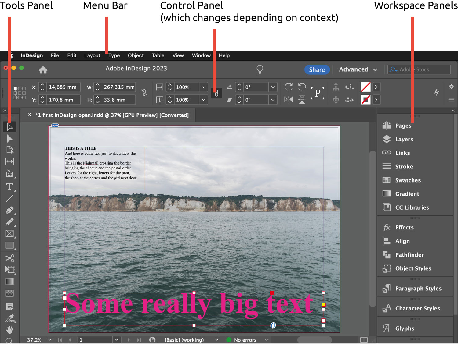
2. Exploring the workspace
Much of the below, but not all, is the same or very similar to what you have in Photoshop.
Menu bar: this is a standard menu bar like all other applications. Try or ⌃⌥⌘H.
Tools: try clicking on the Selection tool (the very top tool that looks like an outlined arrowhead), or just press the short-cut V, then click on the small text on the page, and drag the text to the right side of the page.
Note that some tools have an arrowhead bottom-right. These are for additional tools “underneath”. To get to these underneath tools, for example long-press on the rectangle tool (that’s the rectangle just above the scissors icon) — and see other shape tools appear.
Select the Ellipse tool (underneath the Rectangle tool). With the Ellipse tool selected, drag a shape inside the work area to create an ellipse.
Control Panel: the Control Panel changes depending on what you are doing — and this is very useful. With the Selection tool (the top arrow tool) selected, click somewhere on the background image but not on the target in the centre. Look at the Control Panel and note that you see the parameters of this image frame (x and y coordinates, image frame Width and Height, etc.).
Select the ellipse you have recently drawn, and from the Control Panel…
▷ Make the ellipse into a perfect circle with W for width and H for height 20mm (the “restrain proportions” anchor will need to be un-clicked) as shown below.

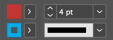
▷ Apply a red fill colour and blue stroke (outline) colour of size 4 pt using the fill-stroke controls in the Control Panel as shown below.
Workspace Panels: select the Type tool (that’s the tool that looks like a “T”) and click once on the “Some really big text”; then click three times quickly to mark this entire text (and note that the Control Panel has changed, to show text parameters); in the Workspace Panels click on Swatches, which opens up the colours; click on white “[Paper]” and see the result.
Go in the menu bar to see many other Panels. Note that you can drag a Panel out of the workspace, and put it back. There are a lot of customisation options, and you can even save your customised Workspace (assuming you really wanted to) at .
Work Area: note that the following (three bullets below) are common to Photoshop and Illustrator too:
▷ To decrease the Work Area document size go ⌘-, similarly to increase go ⌘+, or pinch/unpinch on your trackpad.
▷ To fit the document to the available work area go ; if you have an English QWERTY keyboard go ⌘0 (“zero” not “O”). You can also easily change the work area document size by clicking on the downward arrow at the very bottom left of the window, and choosing a percentage value.
▷ Zoom in so that the document is larger than the workspace: to drag the document, hold down the space-bar then drag (you see a hand).
Changing the screen mode: with nothing selected or just the Selection tool active…
▷ Press W and note that the frames disappear: I work often in this mode as I can better see the result.
▷ Press ⇧W to see a preview: note that you cannot edit in this preview mode — to escape this mode press the Escape key.
(If you press W with the Text Tool selected, this will type a “W” rather than make the frames disappear — rather obvious. So be careful.)
An alternative way to change the screen mode is from .
3. Creating a new InDesign document
If you create a new Microsoft Word document, you generally only have to think about the document format (the size and orientation), like “A4-portrait”, and you are then good to go. In InDesign, you have many options for creating new document, so you need to think about how the document is used, and apply settings accordingly.
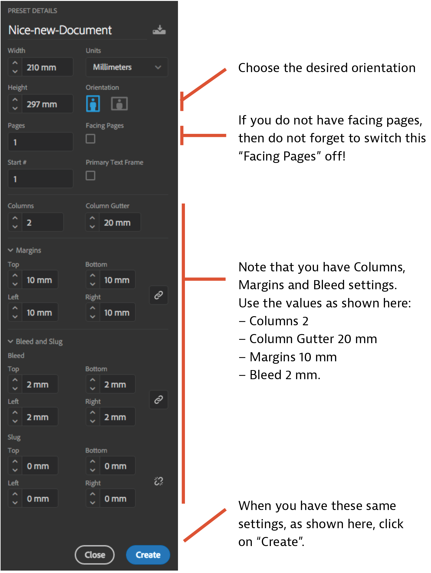
▷ Create a new document: go or ⌘N, and choose “Print” then “A4”, and apply the parameters as shown below.
Notes:
● Column Gutter means the space between columns.
● Bleed is an extra printable area extending beyond the document trim edge so that images or solid colour that go to the edge of the page do not leave small white stripes when print cutting is imprecise.
4. Inserting an image
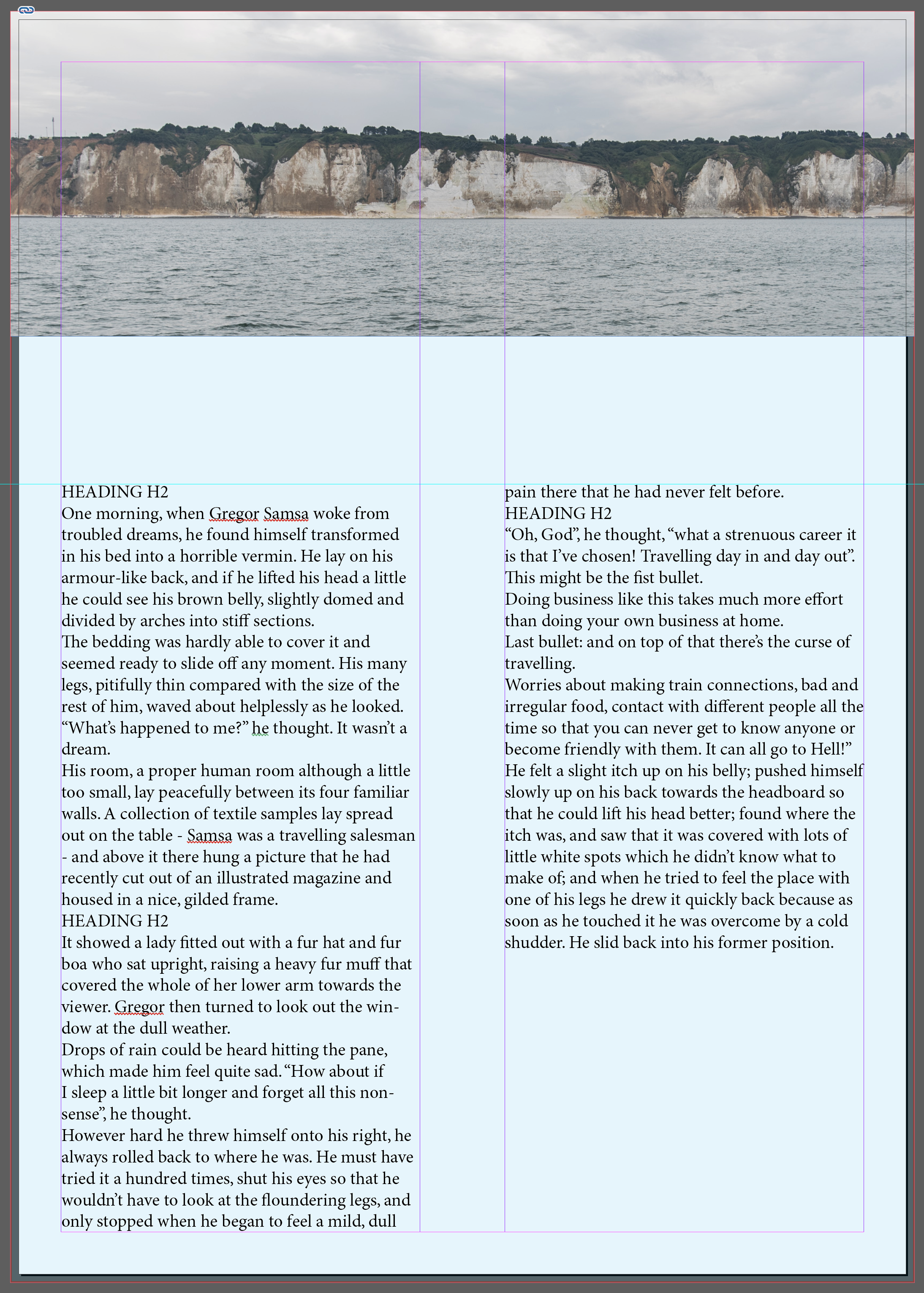
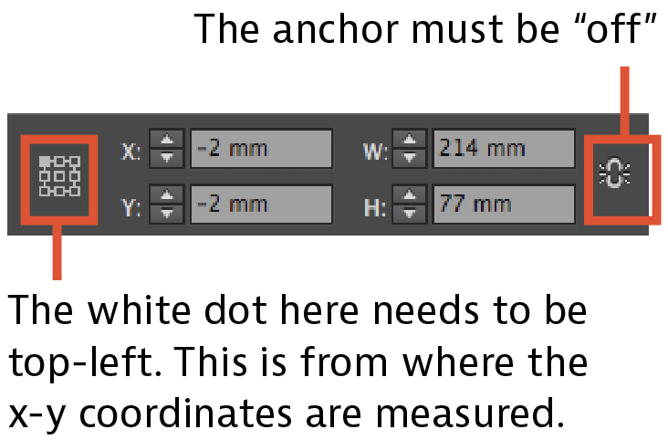
▷ Select the Rectangle Frame tool F (that’s the rectangle with the cross through it just below the Pencil icon), and drag a rectangle box to cover the full width of the page and from top to about a quarter way down the page, and include the bleed (the red-rim) area.

▷ From the Control Panel (with the anchor symbol off), make the rectangle height (the “H”) 77mm.
▷ With the big blue rectangle still selected, go (or ⌘D) to place an image, and navigate to your downloaded course files and click on “cliffs-from-sea.jpg”.
In this example you see only part of the image in the image frame.
Again, if the image does not show clearly, go or ⌃⌥⌘H.
So let’s adjust the image size and position. We want the cliffs horizontally in the centre, with roughly an equal amount of sky above and sea below:
▷ With the Selection tool selected, double-click on the image anywhere except on the target, and you see the bounds of the whole image in brown and the cursor market as a hand.
▷ You can now drag the image. So drag the image until the cliffs are placed at the centre.
▷ But let’s decide that we want to zoom in somewhat: in the Control Panel, go to where you see the horizontal and vertical arrow and check that the constrain symbol (the chain) is clicked, then key in 150%.
▷ Now place the cliff again in the centre, and maybe drag left of right until you like the composition.
▷ Click somewhere outside of the image bound (outside the brown box). The image is now placed.

Repetition: to better see your handy work, press W to remove the guides. Have a look. To preview your work, press ⇧W. Have a look. To get back to where you were, press ⇧W to get out of the preview, and press W to get the guides back.
5. Creating a guide
In InDesign (and Photoshop and Illustrator) a guide is a thin horizontal or vertical line, that you use to align various elements on a document or image.
▷ If you cannot see a ruler on top and left of the workspace, press ⌘R, or go .
▷ Drag downwards from the ruler at the top, and you will see a guide. Drag down until you reach about Y=110mm.
6. Adding text boxes and text
▷ Press the Text tool (looks like a “T”) or press T.
▷ Drag to create a text box from the guide downwards to fill the left text column; do the same for the right.
Click on the Selection Tool or press V.
▷ To “join” the left text box to the right, such that the text flows from the left to the right, with the Selection tool selected, click somewhere inside the left text area so that it is selected: then near the bottom-right of this left text box, on the vertical edge, you will see a small square. Click on the small square, and then click inside the right-side text box. These two text boxes are now linked (and the small squares now have small triangles therein).
▷ Press the Text tool or go T, and click once in the left text box. You will see the cursor blinking top-left: text is expected. So type a small sentence.
▷ To place a large amount of dummy text, go , and the text boxes will fill with text.
▷ But better still, let’s do something else: with the Text tool selected, click somewhere in the text, then go (or key ⌘A ) to select all the text. Alternatively, you can mark all the text by clicking a few times quickly. Then delete all the text (⌫).
▷ With the empty text area selected, go (or ⌘D), and open the resources file “some-text.txt“, to place the text.
And you have now placed some text into the document. You can format the texts and paragraphs with the settings in the Control Panel (the panel at the top).
▷ Change a font or size just to satisfy yourself that you can do this, then undo by repeatedly clicking ⌘Z — actually better to hold down ⌘ and click Z several times, until you are back to just the unformatted text you have placed (have imported).
7. Creating a background colour for the whole page
We are going to create a background colour in its own layer for this document.
▷ Click on Layers in the Workspace Panels.
▷ Click on the “+” sign at the bottom of the layers panel to create a new layer.
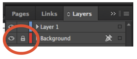
▷ Click on the new layer (“Layer 2”), and name it “Background”.
▷ Drag this layer to the bottom of the layer stack, so that it is underneath (behind) the page content.
▷ With the Background layer still selected, choose the rectangle tool (the plain rectangle just above the scissors icon), and create a rectangle to fill the whole document including the bleed area.
▷ Fill this rectangle with blue by clicking on the Swatches panel (a swatch is a pre-defined colour) and selecting the blue.
▷ Then change the opacity from 100% to 10%, as indicated in the screenshot below.

▷ And then lock the layer in the layers panel, so that you cannot inadvertently edit (change) this background layer content and parameters.
And below is what you should see.
In the next lesson, we are going to format the headings and paragraph texts — using style sheets and colour swatches.
