The previous lesson was about familiarising yourself with InDesign and placing text and image content. This lesson focuses on formatting text, and includes how to install a font and how to apply styles. You will be taking what you produced in the previous lesson and making this more visually compelling.
Download the class material from qoolcat.com/down/indesign-2.zip.
Either open the InDesign file “1_start-indesign-lesson-2.indd” or start with what you had at the end of the last lesson.
1. Formatting texts
Make the document visually attractive: click on the Text Tool and, using the Control Panel (the bit at the top), tweak the fonts, sizes, interlinage, colours etc. Experiment.
Note that you can switch between Character Formatting Controls (the “A”) and Paragraph Formatting Controls (“¶”) as marked in the screenshot below.

Hide the Rulers when you do not need them — use ⌘R to toggle (to switch off then switch on).
Provided you do not have the Text Tool selected, pressing W switches between the Preview mode and the Normal mode. (If you have the Text Tool selected and then type “W”, all you get is a “W” as text, so be careful!) The Preview mode does not show the non-printing elements such as guides, grids, or frame edges — this is the mode I prefer to work in until I actually require the non-printed elements and then I switch back to Normal.
When done, optionally save your work with another file name (), and close your file ( or ⌘W).
2. Installing an Adobe font set
We are now going to install a font set from Adobe. We choose Ubuntu.
▷ Click on the Creative Cloud icon in the menu bar to open the application window.
▷ Click on the “f” symbol top near the right and the Adobe Fonts window opens.
▷ Click on the Browse more fonts button top right, and the Adobe Fonts browser window opens.
▷ Type “Ubuntu” in the search field near the top right, and the Ubuntu font sets open.
▷ In the Ubuntu box, move the slider switch to “Activate 9 fonts”.
The Ubuntu font set is now installed on your computer — it’s as easy as that.
We’ll be using Ubuntu for the exercise below.
3. Creating styles and colour swatches
We are now going to use style sheets and colour swatches to format the texts. This approach has advantages, like (1) fostering consistency throughout your document, (2) saving time becuase applying styles and swatches is quicker than setting these each time, (3) easy to update where you change a parameter just once in the style or swatch rather than lots of times in the document and (4) multi-document or brand consistency by using pre-defined styles and swatches.
Make sure that you have the original InDesign file “1_start-indesign-lesson-2.indd” opened.
Creating the basic paragraph style
From the Workspace Panels, click on Paragraph Styles.
Double click “[Basic Paragraph]”, and the Paragraph Style Options panel opens. Make sure that Preview is ticked bottom left, so that you can see changes as they happen.
Click on Basic Character Formats, and make
▷ Font Family: Ubuntu
▷ Font Style: Regular
▷ Size: 10 pt
▷ Leading 14pt (the space between lines).
Click on Indents and Spacing and have Space Before as 3mm. This is the gap between paragraphs.
Click on Hyphenation and switch hyphenation off, so that InDesign does not automatically try to hyphenate words at the end of lines. (Here, a hyphen is a minus sign character (“-“), which is used to break a long word so that the second part of the word can be placed on the next line.)
Click “OK” bottom right.
Creating a Heading paragraph style
Again, open the Paragraph Styles panel, and click on the middle “small “+” icon at the bottom of the Panel “Create new style”. Double-click on the new [Paragraph Style 1], to open the settings.
In General, for the Style Name write “Heading 2”.
In Basic Character Formats make
▷ Font Family: Ubuntu
▷ Font Style: Regular
▷ Size: 16 pt
▷ Leading 20 pt.
In “Indents and Spacing” have Space Before as 8mm.
Click “OK” bottom right.
To apply this new style to the actual headings, select the first “HEADING 2” in the text, and in the Paragraph Style panel window click “Heading 2”. Do the same for the other two “HEADING 2” texts.
The headings are now styled.
Creating a colour Swatch
From the Workspace Panels, click on Swatches.
Select any colour then click on the “+” icon at the bottom of the Swatches Panel to create a duplicate of the colour, then double-click the new duplicated colour to open the Swatch Options.
▷ De-select “Name with Colour Value”, then type “My blue 2” for the swatch name. (the “My blue” swatch has already been created — here you are just learning how to create this yourself)
▷ Set the four CMYK colour values to 90%, 10%, 0% and 0%.
Click “OK”.
CMYK stands for “Cyan-Magenta-Yellow-Key”, and these are the colours used in printing. “Key” means black, so as not to be confused with the “B” for blue in the RGB colour space. RGB stands for “Red-Green-Blue”, and is the colour space used for light (smartphones, computer monitors and projectors). More about this later in the course.
To apply this new colour: open the Paragraph Styles panel, double-click on “Heading 2”, and in the “Character Colour” tab set the colour to “My blue”.
Click “OK”, and you will see that the headings are blue.
Creating character styles
In InDesign, a Paragraph Style applies to a whole paragraph, while a Character Style applies to selected text within a paragraph.
Creating a Character Style: “blue”
From the Workspace Panels, click on Character Styles.
Now it must be getting pretty obvious:
▷ Click on the “+” Create New Style icon at the bottom of the Panel.
▷ Double-click on this new character style, and name the style as “My blue”.
▷ In Character Colour click on “My blue”.
▷ Click on “OK”.
Creating another Character Style: “strong”
Create another Character Style.
▷ Make the Style Name “Strong”
▷ In Basic Character Formats, have Font Family as “Ubuntu” and Font Style as Medium.
And now you are able to apply styled colour or bold to any character or word within the text.
To satisfy yourself that the character styles work, choose say half a sentence and apply the style “Blue”, and similarly do the same for “Strong”.
4. Tweaking
The document still has some elements missing, like the main heading and a column break where we want it.
Let’s create a column break: place the cursor in the text (Text Tool activated then click) just at the start of the last paragraph in the first text column, and go — as already described above.
Let’s create the main heading:
▷ Select the Text tool.
▷ Create a text box just above the top of the two text columns.
▷ Dimension this text box from the control panel x=10mm; y=85mm, w=190mm, h=14mm.
▷ Type “Kafka this is the H1 heading” into this new text box.
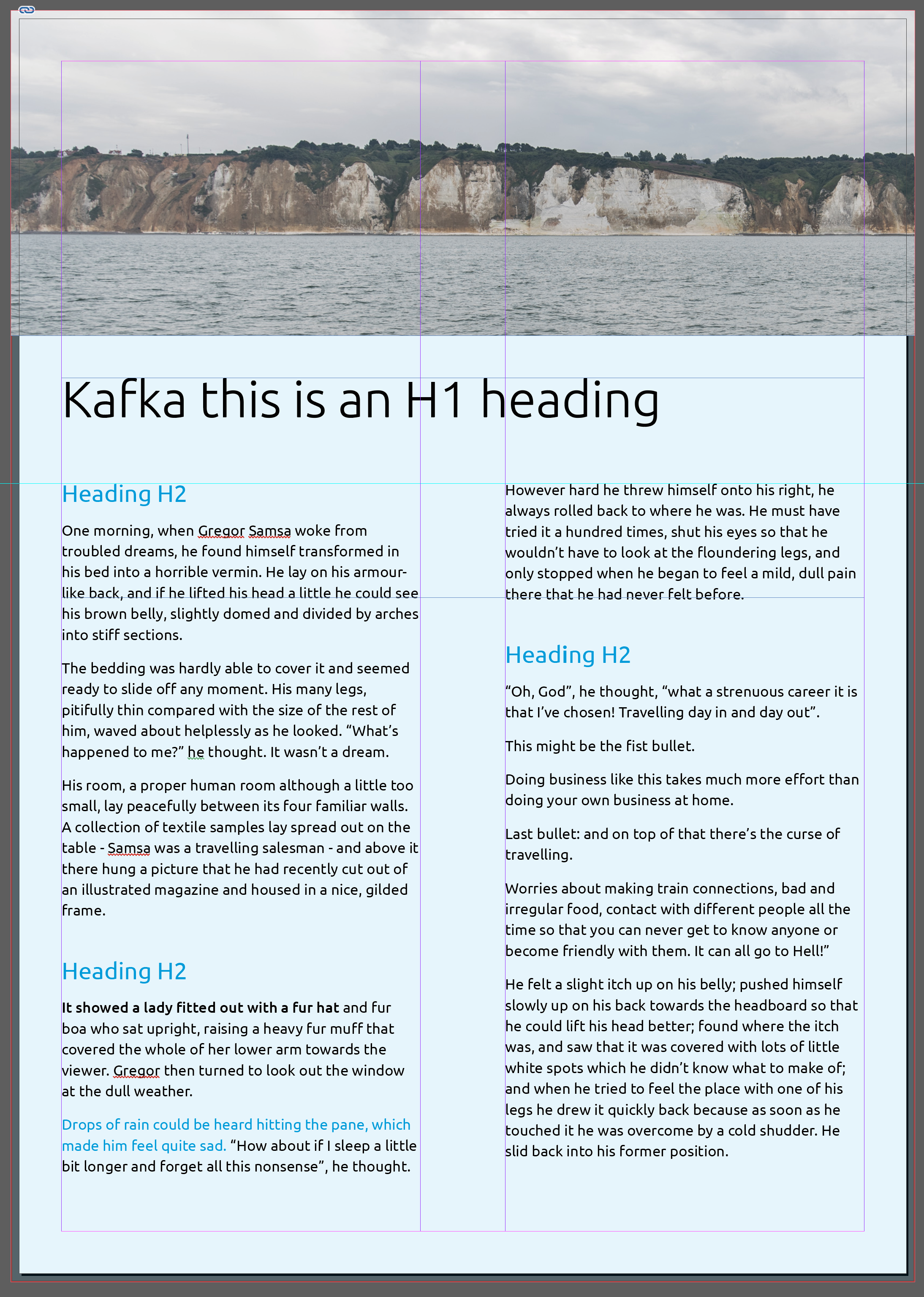
▷ Select the entire H1 heading text and in the Control panel choose Ubuntu Light size 34pt — see below.

This is where we are now…

5. Creating Bullets
InDessign offers many possibilites for creating bullets and tables, and below we show how to do bullets and to use something called Glyphs, where you can access the full character set of any font; later we explore tables.
Creating default bullets
There are several ways you can create text bullets and numbered lists. Let’s start with a quick way…
▷ With the Text tool, select the second, third and fourth paragraph under “Heading H2” in the second column.
▷ Go , and as you can see we now have bullets.
▷ But the text is too far from the bullets (in my opinion).
▷ So with the three bullets still selected, click on the Paragraph icon “¶” in the Control panel then change the first-line indent from -6,35 to -3mm and the left indent to 3mm, and change the space before from 3mm to 0mm, as shown here.

▷ and the bulleted text should look like this…

Creating custom bullets
We are now going to create customised bullets — under our control.
Go ⌘Z until you have removed the bullets.
Let’s get a custom character from Glyphs.
▷ Get the Glyphs panel from — look around.
▷ Drag the Glyphs panel into your Workspace Panels area, so that you have this in the future.
▷ Place the cursor in from of where the first bullet will be inserted.
▷ Open the Glyphs panel, and set the font (bottom left) to Wingdings, and have “Show” near the top set to “Entire Font”.
▷ Double-click on a solid rectangle character, and the solid rectangle will be inserted at the start of the first bullet.
▷ From the Character Style panel make the bullet symbol blue.
▷ Place the cursor between the bullet and the first letter of the text and press the “tab” key ⇥.
▷ Copy-paste the bullet+tab to the other two bullets below.
Let’s make the custom bullet.
▷ Select the three bullets.
▷Click on the Paragraph icon “¶” in the Control panel, change the left indent to 4mm, then change the first-line indent from 0 to -4mm, and change the space before from 3mm to 0mm.
▷ And the bulleted text should look like this…

Create bullets with a style sheet
You can create bullets and numbering also from within a paragraph style.
6. Tweaking styles and palettes
Here we show how efficiently we can change format and colour.
Assume it is decided that we should have a horizontal line above the H2 headings
This is not completely intuitive…
▷ From the Paragraph style panel open the “Heading 2” style.
▷ Click on Paragraph Rules.
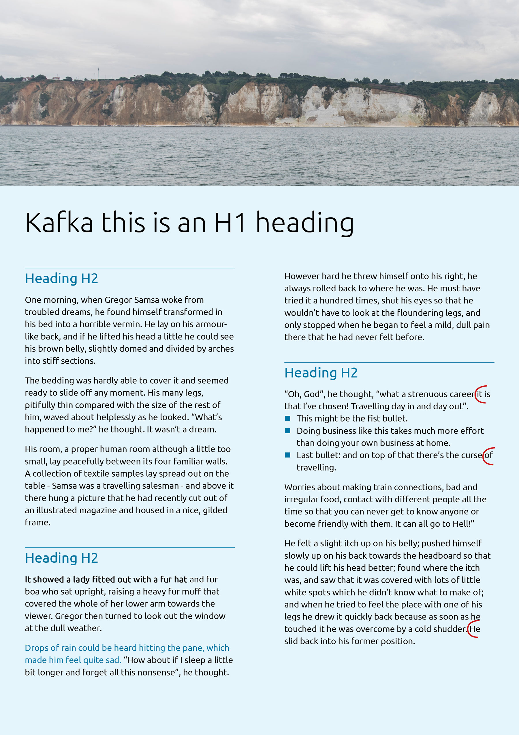
▷ Select Rule Above, have Rule On ticked, Weight 0,5pt, Color “My blue”, Offest 6mm.
Assume it is subsequently decided that the document blue should be a darker blue.
Easy: in Swatches just change the parameters of “My blue”. I used CMYK 90 / 10 / 0 / 35, and all the blues in the document are changed.
Lastly, it is good practice to look at the document and place onto the next line any short-words sticking out at the end of the sentence, as shown below in red. You do this by replacing the space with a non-breaking space: select the space after the last word (that you want to move the line below) and go or it is quicker just to press ⌥⌘X.

7. Creating tables
It is easy to create a table in Microsoft Word or Apple Pages. As you would expect, making a table in InDesign is also simple, furthermore InDesign offers easy flexibility for creating and editing tables.
Below I do not give a tutorial type instruction but simply describe generically how to make a table.
Consider these two tables which convey identical information. The one on the left was created in Word with typical default settings; right is an InDesign table, which one could mimic in Word — but not easily.

To create a table in InDesign…
▷ First create a new document in InDesign.
▷ Create a text box into which the table will be inserted.
▷ With the text box and text tool selected, go
▷ In the Create Table dialog window, key in the number of columns and rows etc., and note that this is easy to modify later.
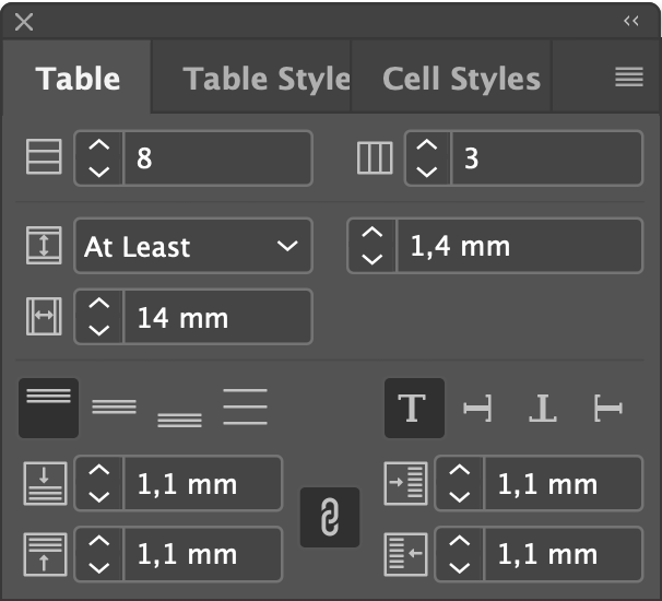
▷ If the Tables Panel is not already activated, go , and this is what you see.
▷ Edit the table row and column sizes by dragging or with the Tables Panel.
▷ Edit cell margins and spacing with the Tables Panel.

▷ Fonts and the font parameters, as well as table fill and strokes (the outlines), are done from the Control Panel.
▷ The screenshot shown here is an example where the value cells (i.e. not the heading) of the table top-right are selected. See the orange marked box: the stroke of 0,3 pt applies to just the bottom of the table as indicated as a blue line. If we wanted to have all vertical lines also in black 0,3 pt, we would need to click on the three vertical lines (of the marked orange space) which on selecting would become blue. So the fill value applies to which cells you have selected; the stroke applies to the blue lines (in the orange box indicated here) of the cells you have selected.
▷ Use the mouse right-click or the menu to insert or remove rows or columns, to combine or split cells, and for more options.
