Here we discuss topics that apply to more than just one of the Adobe Creative Suite applications, or were not covered in the lessons and exercises, or where further practice or emphasis is deemed be desirable.
1. Colour
The rendering of colour, on various media and devices, is a sophisticated topic and here is a very short introduction.
For PRINT one uses four colours to create all colours — think of pigments: this colour space is called CMYK which stands for Cyan-Magenta-Yellow-Key.
(The “K” in CMYK stands for “Key” meaning Black, so as not to be confused with the Blue “B” in RGB.)

For example, the darkish green colour below is C 100%, M 20%, Y 100%, K 0%.

For projected LIGHT, as in computer and phone monitors hence the internet too, one uses RGB for Red-Green-Blue.

The same colour can look different when seen on different monitors, or printed on different printers and with different paper. And a device rendering of colour is often imprecise. Graphic professionals use special hardware to colour-calibrate their monitors and printers! This is further complicated by something called a colour “gamut” and device colour profile — which is to do with how much colour “detail” one can see at the extremes and how colours are mapped.
A wider colour gamut means that a device or output can display or capture a larger range of colours, which can result in more vivid and lifelike images.
For offset and professional digital printing use CMYK, and a printing company will tell you what PDF print settings (and image colour profiles) are required.
For web and other electronic media use RGB.
To switch between colour spaces (CMYK or RGB), in Photoshop you go .
For print, one sometimes uses special colours.
- For a business card, one might want to use two colour printing, for example a particular red and a particular cool grey — and the final result will look somehow more pleasing than the “manufactured” CMYK red and grey.
- For a luxury book, one might include a fifth colour for the titles, where in addition to the standard four colours CMYK, the designer might choose an additional (fifth) colour for say the titles, say a subtle gold colour.
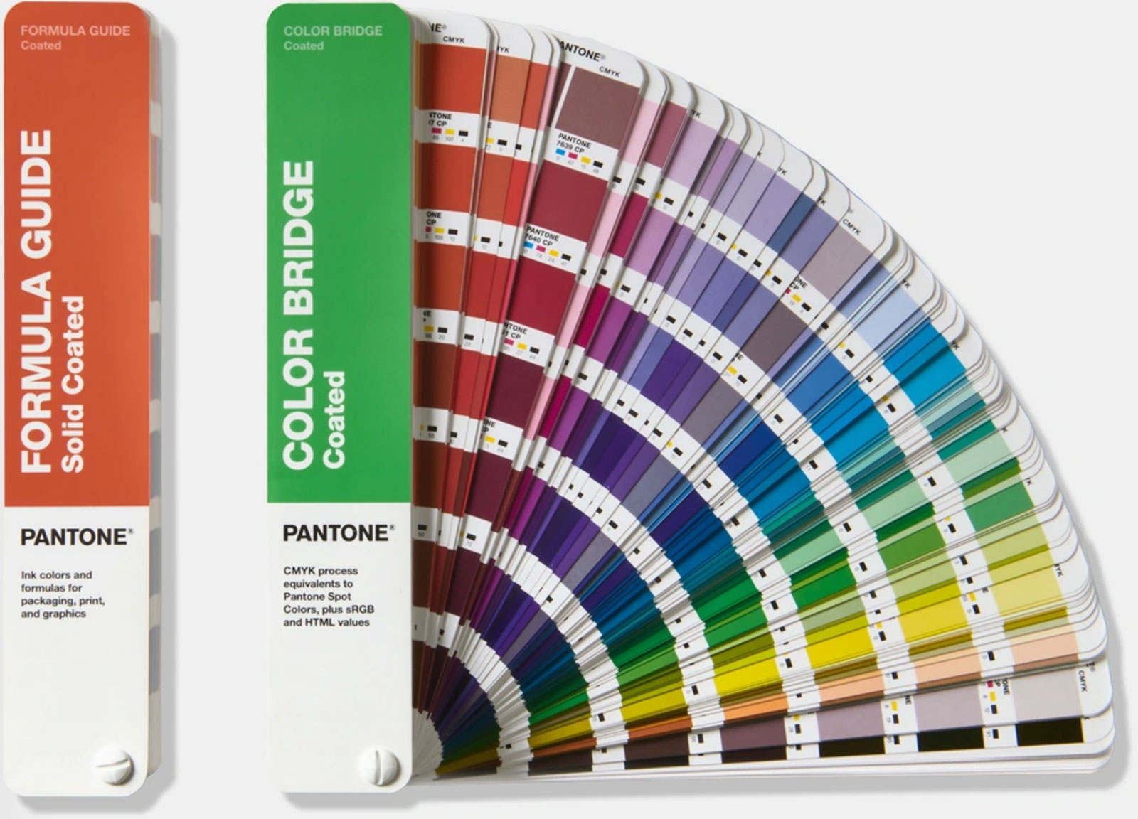
For this specific non-CMYK colour, you stipulate a colour based on a PANTONE colour code, as explained below.
2. PANTONE
Above you see a green colour of CMYK 100,20,100,0. But one cannot be absolutely sure what this colour actually looks like — it depends on the colour gamut of the device rendering, or whether you are seeing this on glossy or matt paper, etc. So for print, PANTONE has emerged as the global standard — via standardising colour palettes.
For example, the Swiss flag colour red is stipulated as PANTONE 485C or 485U, “C” for coated material and “U” for uncoated.
If you are referencing a PANTONE colour in an InDesign (or Illustrator) document, it is desirable to have a PANTONE Connect Premium account so as to have this colour in your Swatches Panel. However PANTONE no longer supports training institutions with free accounts.
Installing a PANTONE account
If you have an account email address, this is how you install a PANTONE Connect Premium account.
▷ From either InDesign, Illustrator or Photoshop go .
▷ On the exchange, find Pantone Connect and install it.
▷ When back in the application, go and log in to your premium account with an account email address.
▷ If the PANTONE confirmation email gives its ambiguous error notice then just ignore this.
Once you have a PANTONE Connect Premium account…
▷ Go .
▷ Then use the search window to search for the colour, like a warm grey “11 U”
▷ The rest is obvious, for example roll over the search result colour rectangle and click on the three dots.
A practice exercise with the Pen Tool, PANTONE, and export
Using say your smartphone, photograph a friend’s face and neck in profile.
- Create an A4 portrait Illustrator file.
- Import the profile photograph into Illustrator and lock the layer.
- Create a new layer and create a profile shape by tracing with the pen tool; have a horizontal base (use a transparent fill while tracing).
- When finished (when you have the profile traced), delete the photo to leave just the profile.
- Make the fill colour PANTONE Warm Gray 11 U (“U” means uncoated). If you do not have PANTONE installed, then simply Google something like “RGB equivalent for PANTONE Warm Gray 11 U”.
- Save your work.
- Create a new Illustrator file for web 720px × 720px, and paste this profile.
- Resize the profile image as appropriate.
- Then save it as a PNG file. (For exporting an Illustrator file as PNG, I still use the old-fashioned , because I like the interface.)
It is generally preferable to export an Illustrator file (like a logo or diagram) as a vector, like SVG. However, some applications do not accept a vector format as input. Hence PNG, which is a pixel formal.

3. Sizing and saving JPG images for web
In preparing JPG images for the web, you can substantially reduce the file size by reducing the quality — but nobody can see the difference so you are in a sense getting this with no quality penalty — the JPG format uses a clever compression algorithm.
Download the resources from qoolcat.com/down/bits-and-pieces.zip
and open “and.jpg” in Photoshop. We are going to make this image 1200px wide for use on a website.
▷ Go , click “Resample”, and make sure that the units are “Pixels”.
▷ So make the width 1200 pixels and set Resample to “Bicubic Sharper” for reduction. Click OK.
▷ To reduce the file size (hence quality) for web so that the web page downloads faster, go , and
—▷ choose JPEG as the format (second item top right)
—▷ choose sRGB as the colour space for web
—▷ choose “2-up” top left, so that you can see the original image alongside the reduced image.
(Do not worry that this is “legacy”: it remains a much-used way to do this.)
▷ Move the quality setting to zero, and look at the quality difference (look at the bow tie, collar and “And?” writing).
▷ Keep increasing the quality setting until you just cannot see a difference. Then add another 10%.

Look at the difference in file size (shown under the image) between the original and the web-optimised image. The web images is much-much lighter, but one cannot tell the quality difference. Cool!
▷ Click “Save” to save this new image.
People often slightly over-sharpen an image when preparing for web, and this is considered good practice, so try the following on the original (reduced size but not reduced quality image). Go , and set Amount to 40% and Radius to 1.0, and click and un-click Preview to see the difference.
A more sophisticated way to sharpen is via , which offers more parameters — but this might be overkill.
It would have been quicker to reduce the pixel dimensions directly within the window, but then one could not have applied the sharpening.
For pixel images like photos, there are two emerging formats for web, namely AVIF and WebP, which offer better compression than JPG. Some website content management systems (Drupal and WordPress for example) will automatically convert a JPG image to say WebP.
4. Sizing images for print
This is very important, and not altogether intuitive.
In offset and digital printing (that is for “usual” paper printing like in business cards, brochures, posters, books…), one talks of “DPI” for image size requirement. DPI means “dots-per-inch”. A typical requirement is 300 dpi which is about 120 dots (pixels) per centimetre. 120 pixels per centimetre is a good rule of thumb for print.
So how does one know if one’s image is large enough such that you have at least 300 dpi?
First of all, you can calculate: an image 3000px wide at 120px/cm would be okay in print if no more than 3000/120 = 25cm wide.
But here is a method:
▷ Open “elephant.jpg” in Photoshop.
▷ Go , and set the Resolution to 300 Pixels/inch with Re-sample unchecked.
▷ Save this Photoshop file.
▷ Create an A4 portrait document in InDesign, and place the elephant and green background as shown here.
▷ Double-click on the elephant image to show the image frame (the brown frame), and note that the recorded size is much more than 100% (160% in this example — see below). One can maybe go up to 120%, but more than this becomes potentially “dangerous”.

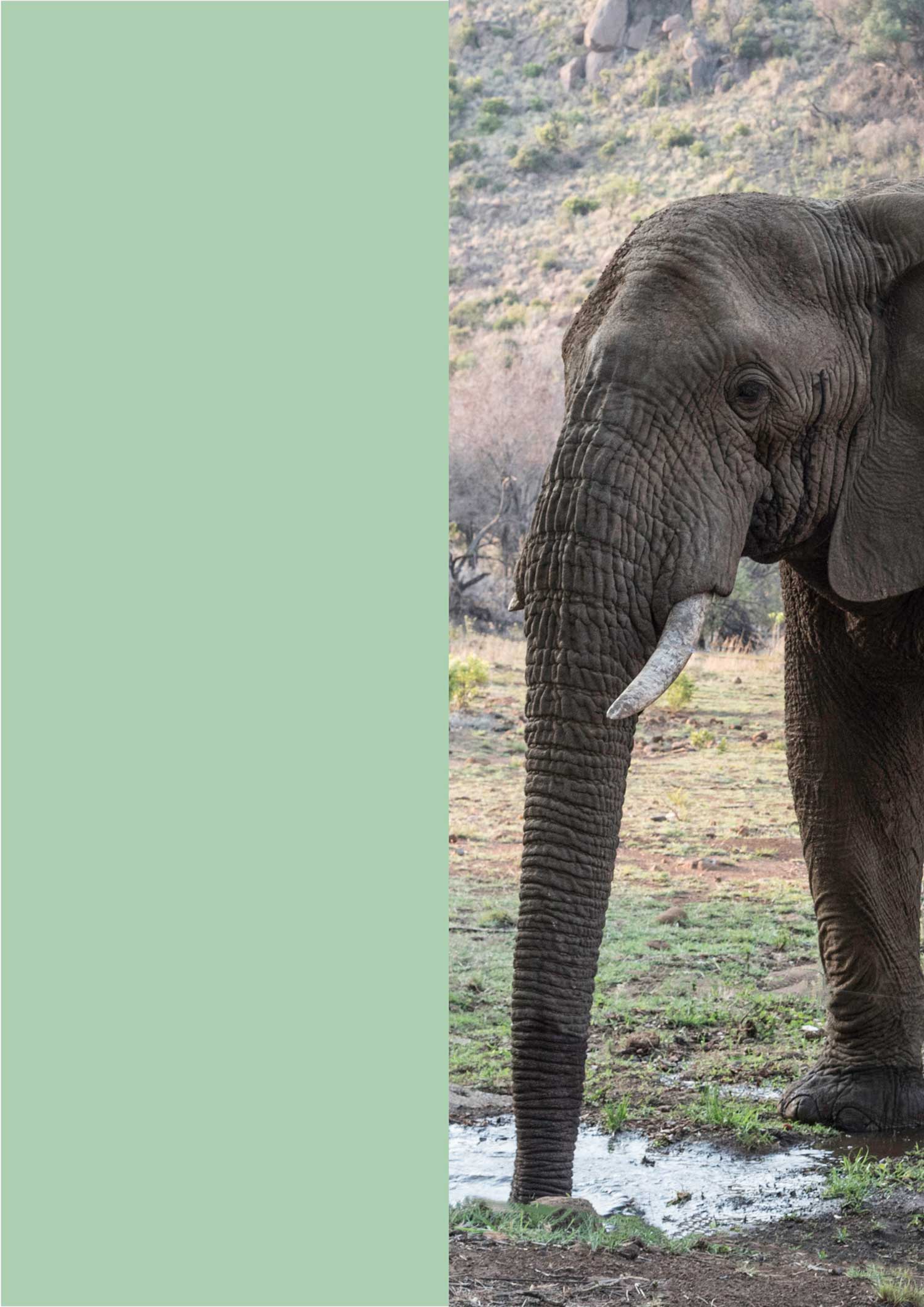
So in this example, we have a problem: the image is not large enough for how we want to use it, so either find another image, or try to grow the image to some extent in Photoshop, or use another design.
Another way to check for image size (that I use all the time) is to open the InDesign Links Panel and in the Links Panel Options tick “Effective PPI”. When clicking on an image the effective PPI (PPI means the same as DPI) should generally never be much less than 300.
5. Checklist for print
To have your InDesign work successfully printed at an external offset or digital printer, you need to get all of these five points right.
- Have the correct InDesign document settings, including bleed, margins and page configuration, as was explained in InDesign Lesson 1, section 3 (and do not forget to switch off facing pages unless your document has facing pages).
So when creating a new InDesign document — concentrate!
- In InDesign never forget to respect bleed and margins (like all elements that go to the edge of the document must go to the bleed).
- In InDesign (with Photoshop) respect image sizes, usually a minimum of 300 dpi (“dots per inch”) for conventional printing. 300 dpi is approximately 120 pixels per centimetre. This was discussed above.
- In Photoshop convert pixel images to the correct mode and colour profile (according to the printer instructions).
The colour profile depends on the paper used, for example “Coated FOGRA39” is typical for coated paper (go which conveniently also converts your image to four-colour CMYK).
- In InDesign, export the PDF with all the correct for-print settings as stipulated (go , and set the “PDF Preset” as typically “PDF/X-1a:2001” then click on “Marks and Bleeds” and set marks and bleed as per the printer’s instructions). This was discussed in InDesign Lesson 4, section 2.
When designing for print, always produce a mock-up where possible, because on-screen sizes/look do not always give a correct impression for print. For example: when designing a long report, print a few pages 1:1 to see if the print size looks about right; the same for a brochure; when designing a large poster try to mock it up in some way, for example using a PSD template or photographing the space where the poster will hang and then placing the poster with Photoshop.
If you are exporting for electronic viewing (say for web or with email) then: choose a different “Adobe PDF Preset”; switch on “Include Hyperlinks” etc. as appropriate; switch off “Marks and Bleeds”.
For solid colour shapes like logos, always use the vector rendering of the image where possible (Illustrator, EPS or SVG formats for example), because these are typically lighter and result in a crisp result.
6. Creating a mockup using a Photoshop PSD template
A very good way to show off a new logo (or an old one), or a poster, flyer whatever, is to mock it up in a real situation using a pre-made Photoshop PSD template. So, for example, if you wanted to show what your logo would look like when printed on a mug, you can Google something like “free mug PSD Photoshop mockup template”.
Open in Photoshop the file (from the downloaded resources) “mockup-mug.psd”, then…
▷ Double-click the layer entitled “Your Design Goes Here”, and the layer opens in a separate Photoshop workspace, showing just a mockup graphic.
▷ Make this layer invisible by clicking on the eye on the left side of the layer in the Layers Panel.
▷ Add a new blank layer by clicking on the Create new layer icon at the bottom of the layers panel.
▷ Open “hello.ai” in Illustrator and copy-paste it into the open layer in Photoshop, and in the Paste pop-up window mark Pixels.
(To copy from Illustrator, with your Illustrator file open go or ⌘A, then or ⌘C. To paste into Photoshop, select the Photoshop layer that you want to paste to and go or ⌘V.)
▷ Resize as appropriate holding down the [option] key ⌥ to retain the proportions, and press [enter].
▷ Save just this separate object workspace (go ).
Now return to the Photoshop workspace that displays the full mug, and note that “Hello!” is displayed.
Cool?
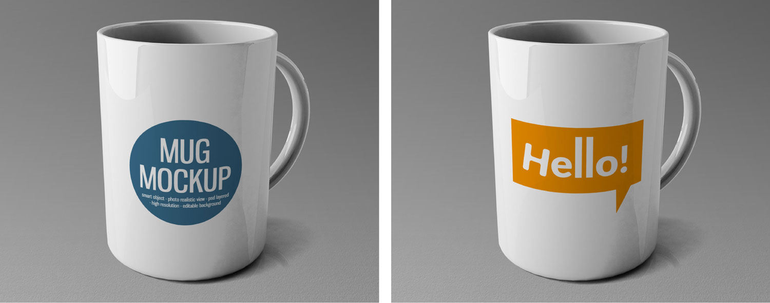
We happen to have used an Illustrator file for the insertion image, but we could equally well have used a PNG, JPG, or other formats.
Different PDS mockup templates might be a little different it their application, but this is usually easy to work out.
Note that there are lots of things you can mock up, like a wall with logo protruding, office stationery set, an A4 page, brochure, book, product packaging, a hat, street billboard, signage…
I have prepared a small collection of PSD mockups at millnerdesign.com/stuff/x-mockups.zip: a wall, stationary set, A4 page, cap and street billboard. For the company-logo-on-wall, the mockup uses transparency as the base of the wall and fill as the raised content.
Important
A PSD file is normally very big (very large file size). If you want to save as a JPG, you need to first flatten the image. Go . Then go , and select JPG as the format.
7. Creating a mockup using Illustrator
This is new to Illustrator 2024.
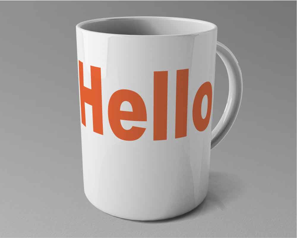
▷ Open in Illustrator the file (from the downloaded resources) “plain-mug.ai”. Note that this image is a mug as an embedded JPG and a “Hello” as a vector gaphic.
▷ Select both components (the embedded JPG and vector graphic), and go .
▷ When Illustrator has done its thing, drag and resize the “Hello” element to suitably position it on the mug.
▷ To make the textures more realistic, open the Transparency panel: . Change the mode from Normal to Multiply and reduce the Opacity a little, maybe to 85%.
▷ If the logo turns black when you apply the Multiply mode, you need to tweak a setting first (sorry), then first do the below
(Fixing black artwork when applying transparency: Sometimes GPU acceleration bugs out, rendering transparency as solid black: For MacOS go or Windows go : then uncheck GPU Performance. Restart Illustrator. Now transparency should preview correctly.)
Obviously, instead of an image of a mug, you could have had somebody wearing a shirt, a surfboard, tote bag, book, hat, whatever…
