Digital photographs are made up of pixels — "tiny dots". Photoshop is about editing pixel images hence editing photographs.
If you continuously zoomed in on a photograph you will eventually see individual dots or rectangles — the individual pixels. A typical reasonably good camera might have a pixel resolution (dimension) of 6000 × 4000.
Photoshop is a vast application that has evolved over many years. It is huge in terms of functionality and I doubt that anybody really knows all of Photoshop.
Here I teach those parts of Photoshop that I myself use: the really useful bits for a web and graphic designer and photographer (serious photographers would also use Lightroom Classic).
I will divide what I teach in Photoshop into two sections:
- Image adjustments: adjusting things like white balance, exposure, contrast, saturation, cropping, etc., and in modern times these are done mostly in Photoshop Camera Raw (the Camera Raw Filter), even when you are not working with a RAW image.
But the Photoshop Camera Raw engine has become so powerful that the distinction between adjustments and manipulation is no longer that evident — so adjustments now include some manipulations. - Image manipulation: this is when one cuts portions of images out, uses layers, retouches, and does many wonderful things within the main Photoshop space.
I will also go through how to easily make sophisticated mock-ups using pre-made PSD template files (see the Bits and Pieces page) — this does not fit into the neat categories above.
Note that:
- Some things that one can do in Photoshop, like build a composite layered graphic or tint an image, can be done equally well in InDesign. In InDesign one can better see the desired end result in the context of a document.
- All that can be done in the Photoshop Camera Raw Filter can be accomplished also in the Lightroom Classic application which is included in your Adobe Creative Cloud suite. Lightroom Classic additionally has a workflow that is geared toward photography.
In 2017, Adobe renamed Lightroom to become “Lightroom Classic”, and introduced a new Lightroom package (confusingly called just “Lightroom”) which includes also Lightroom for smartphones and tablets. For example, when you take a photo with your phone with Lightroom (using the Lightroom photo application), the photo is then automatically synchronised to cloud storage, and can then be edited on your computer. This pack is included as part of your Adobe Creative Suite subscription — you own this! Try it out sometime.
1. Opening an image and exploring the workspace
Download the class material from qoolcat.com/down/photoshop-1.zip.
Unzip the file which is in a single directory (a folder with files in it) by double-clicking on the ZIP file.
Open the image “1_baboon.jpg” in Photoshop.
(To open, right-click on the file then go .)
▷ So that we are on the same (useful) workspace, go .
(A Workspace is an arrangement of Workspace Panels and Meu Bar — and Photoshop offers several workspaces.)
Note that, when you update an Adobe application like Photoshop, the workspace might revert back to the default, so you again then need to set the workspace.
This is what you should be seeing in Photoshop…
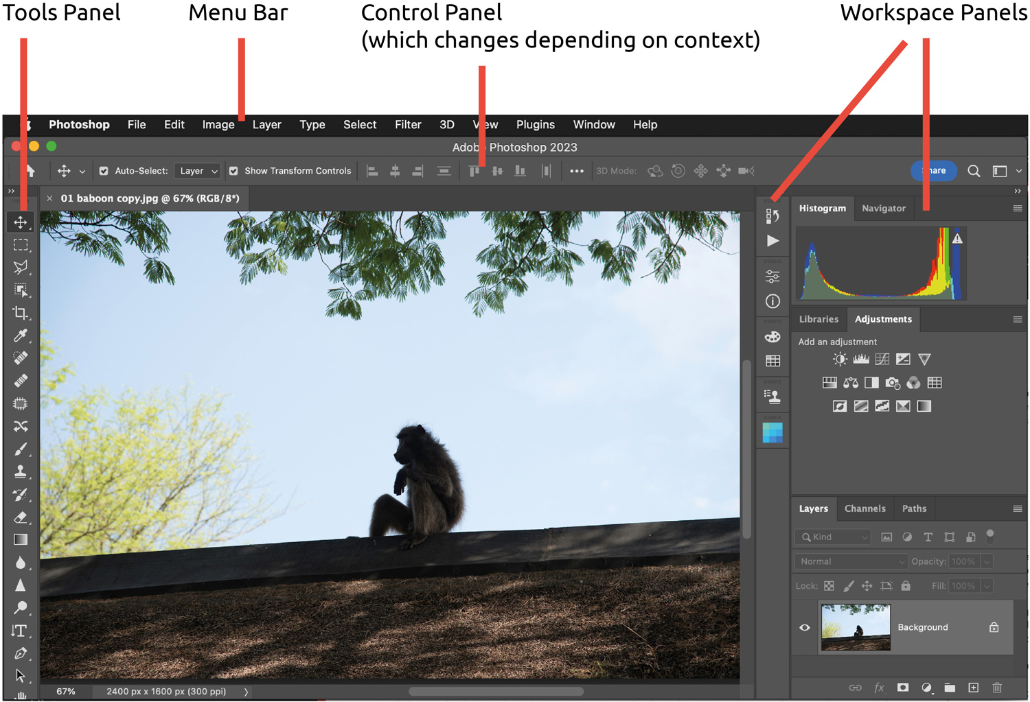
And, besides the actual image, note the four main elements…
Menu Bar: this is a standard menu bar like in all other applications.
Tools Panel: all the tools, many of which you will soon become familiar with. If a tool icon has a small triangle in the bottom-right corner, then pressing on the tool reveals more tools (“underneath”). See the example below.

Control Panel, also called the options bar: this changes depending on what you are doing so becoming like a very large context menu — it is very useful.
Workspace Panels: these are arrangements of tables and visualisations with parameters, for accomplishing much of the heavy work, which will become obvious in the next Photoshop lesson.
Contextual Taskbar (not shown above): a context-aware bar that floats on your screen, offering common tools, actions and next steps on the canvas where you’re working. You can drag this bar to another location if you want. Often, the next steps shown in the lessons will be available from this bar.
2. Cropping and levelling
Suppose that, for the baboon image, you want (1) the top of the roof to be horizontal and (2) a crop ratio of 4:3.
▷ In the tools panel, click on the Crop Icon (as shown here), or go C for crop.
▷ In the options bar, make the ratio 4 and 3 (for 4 wide to 3 deep), and check that Fill is set to Background (default).
▷ Place the cursor just outside of the image area and you will see a two-arrowed icon. Drag on the two-arrowed icon to rotate the image, and make the roof horizontal.
▷ Crop to your taste by dragging the crop handles, maybe cropping out some of the roof foreground, and moving the baboon a little to the right because symmetry is unattractive here.

3. Adjustments with the Camera Raw Filter
▷ Go , or ⇧⌘A, and the Camera RAW space opens. Look around.
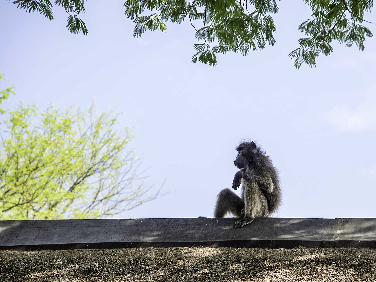
As you can see, the baboon — the subject of the photo — is underexposed.
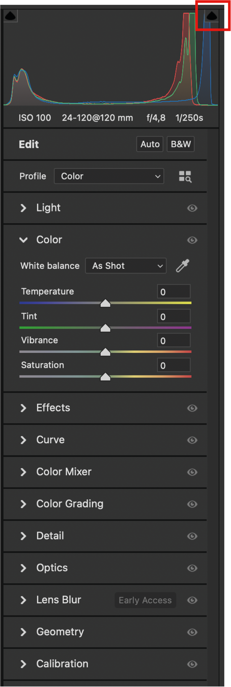
Make sure that the Color panel is open, as is shown here.
First, try a “quick and dirty” with the basic settings:
▷ Click on Auto near the top of the panels (see 1): note how the sliders move and the picture transforms.
▷ Change the White Balance from As Shot to Auto (see 2) and the colour temperature changes.
See how the image has been transformed into something one could use.
Go ⌘Z several times to get back to the beginning, and you will now do things manually and under your full control:
▷ The sky is correctly exposed while the baboon is too dark, so let’s lift the shadows: open the Light panel, and move the Shadows slider about two-thirds right to about +67. Lifting the shadows is something one often needs to do!
▷ Maybe we could want some more clarity (more local contrast): open the Effects panel and move the Clarity slider a quarter right to about +25. Note how the image has changed. Increasing the local contrast (the Clarity) is something I often do!
▷ Play with all the sliders in the Light panel to see what changes.
▷ Play with the zoom settings bottom left.
▷ Note that if you click on a slider but do not necessarily move it, you can use the up and down arrow keys to do small increments. Note too that you can key in a value (generally -100 to +100) for the sliders. If you double-click a slider the value returns to zero.

Some further explanation:
In the Color panel sliders
Temperature and Tint sliders are about setting the White Balance (also called the “colour temperature”). If you have a neutral white or grey colour in the photo you can use the White Balance Tool (the pipette) and mark this neutral spot.
Vibrance is for saturation in the mid-tone area.
Saturation is for the intensity of the colour.
In the Light panel sliders
Exposure (overall brightness of image mid-tones) and Cotracst (relative brightness) are obvious.
Highlights is to control the exposure of the lighter areas.
Shadows is to control the exposure of the darker areas (and we used this for the baboon).
Whites is to control the exposure of the very light areas.
Blacks is to control the exposure of the very dark areas.
In the Effects panel sliders
Clarity is for local contrast.
Dehaze is to increase or decrease haziness by changing image contrast and saturation.
The histogram (which is the graph top-right) shows the distribution of image colour from dark (left) to light (right). I will now explain how you detect clipping — which means that the exposure is out of range — too dark or too light such that you have lost all detail:
▷ Click on the black triangle symbol marked top-right in the diagram here.
▷ Move the Exposure slider slowly to the right, and see what happens: the parts of the image that are too light become bright red, to show where there is too much exposure to show any detail. Click again on the symbol to switch this off.
▷ The same would work for shadow clipping (image too dark) with the corresponding symbol on the left. Try this.
▷ Move the sliders such that you have an image that is to your utmost satisfaction. Click repeatedly on the rectangle symbol which is at the bottom of the workspace near the right (as shown here) to scroll through the various before-and-after renderings.

4. HSL / Grayscale with Camera Raw Filter
(HSL stands for Hue, Saturation, and Luminance.)
You should still be in the Camera Raw Filter space with the baboon image still open.
Let’s make the sky a little bluer:
▷ Open the Color Mixer tab.
▷ Make sure that Adjust is set to Color.
▷ Click on dark blue circle.
▷ Move the Luminance tab left by a little, and the sky will become a little darker blue.
Simplified explanation:
Hue is the actual colour; Saturation is the “greyness” colour; and Luminosity is the “whiteness” colour.
Let’s make this into a black-and-white image
▷ Near the top, next to Edit, click on B&W for back and white.
▷ Open the B&W Mixer panel.
▷ Experiment with the sliders, particularly the blue and green.
5. Masking with Camera Raw Filter
Selecting the sky and the subject
You should still be in the Camera Raw Filter space with the baboon image still open.
Now the boundary between Photoshop editing for adjustments and for manipulation becomes blurred!
Click on the Masking symbol near the top right and have a general look.
As an example:
▷ Click on Select Sky for just the sky. Experiment. (Note that this automatic sky selection is pretty good but not perfect, but probably good enough for most uses.)
▷ Click on X to invert, for selecting everything except the sky.
▷ Now cancel this selection (click on three dots next to “Mask 1” and click “delete”)
▷ Now click on Select Subject: impressive, hair and all!
Experiment by moving some slider settings. When done you can click “OK” bottom right to commit your changes to the image.
Selecting features of a portrait

Now open “2_family-in-paris.jpg” in Photoshop.
Again, go , or ⇧⌘A, and the Camera RAW space opens.
Again, click on the Masking symbol near the top right but this time long-click (press) and a dropdown menu will appear. Choose Select People and after a few seconds Photoshop has recognised the four people as indicated by the four icons beneath “People”.
You are now going to apply some henna to the hair of the mother (make the hair redder)…
▷ Click on the “Person 1” icon (that’s the mother), and note that the mother is selected (in red), and note too that individual portrait features have been identified (Face Skin, Body Skin, Eyebrows…).
▷ Click on each portrait feature to select, then click to de-select — and satisfy yourself that Photoshop is indeed capable of selecting these.
▷ Select just the Hair and then click on Create. Note the many sliders that become available for just the hair.
▷ But Photoshop has selected also some of the girl’s hair below the mother: So click on Subtract then click on Brush and, make sure that the Flow and Density sliders are both at 100, brush out the girl’s hair — so that just the mother’s hair is selected.
▷ Open the Curve tab if not already open; select the red adjustment; drag the curve slightly upwards and the hair turns red. Further adjust the red-ness by slightly moving the Hue and the Saturation sliders above, until you are satisfied with the result.
▷ Note that had you not been satisfied with the selection, you could have clicked on Add or Subtract, but here the selection is fine.
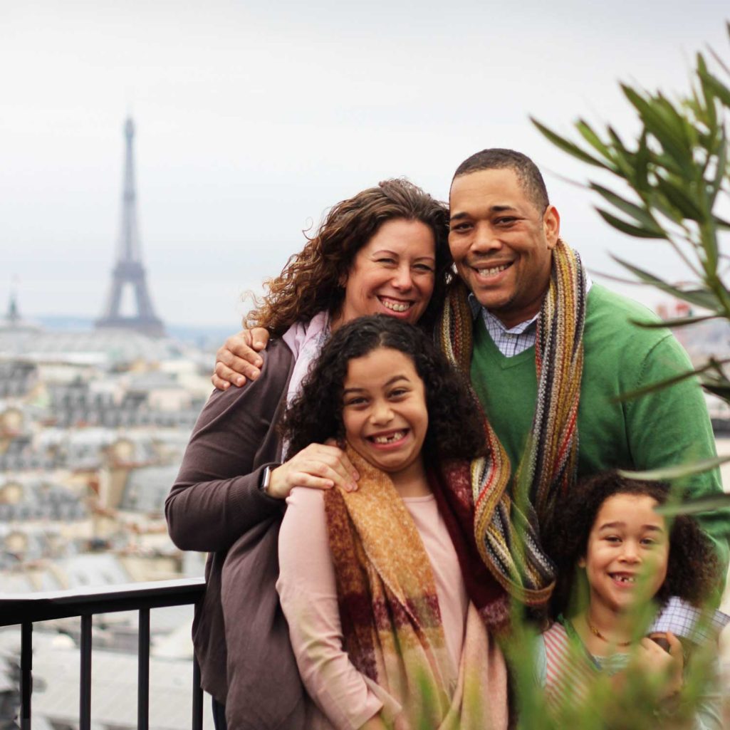
Photo by Loly Galina on Unsplash
Other useful things you can do with these portrait features include
- Apply lipstick
- Whiten teeth by reducing Saturation, or adding more White, or increasing Exposure.
- Whiten the whites of the eyes (the “Eye Sclera”) using the same as you do for teeth.
- Modifying the colour of the eyes after selecting “Iris and Pupil”.
- Smoother facial skin, particularly with older people, by reducing the Clarity or the Texture.
Such modification should not be overdone — better to have a subtle effect.
Photoshop is using machine intelligence to make the selections as above, and it does not always get this right or accurate enough. Note that there are other ways to, for example, whiten teeth — then just google something like “how to whiten teeth in Photoshop”.
(New in Photophop 2025: a select people functionality with even more detail — see later.)
6. Detail menu
Noise reduction
Often photos are taken in low light hence have high ISO values and this introduces noise — graininess. First, you will apply noise reduction.
Open “3_shark.jpg” in Photoshop.
▷ Open the Camera Raw Filter by going , or ⇧⌘A.
▷ Open the Details panel.
▷ Zoom to 200% — the zoom value is the very small number very bottom-left.
▷ Hold the space-bar and drag the image so that the shark’s eye is approximately in the centre.
▷ Note that the image contains a lot of noise, so move the Noise Reduction slider maybe halfway across to about 50, and note that the noise has mostly disappeared.

Sharpening
▷ While looking at the eye, move the Sharpening slider to maybe 30.
▷ Change the zoom to “fit in view”, and note how the image has been improved.
▷ You might want to go to the Effects panel to further improve the image, for example by increasing Clarity maybe to +50. Try this!
▷ Click “OK” bottom right.
7. Spot removal
You should still be in the Camera Raw Filter space.
This photo was taken into a fish tank so there are a lot of spots, which you will now remove.
▷ Click on the Remove tool on the right (eraser icon as shown here on the right).
▷ This opens the Remove panel offering three options as shown below: (1) Content Aware Remove (2) Heal and (3) Clone.
Content-Aware Removal automatically replaces the selected area with content that matches the surrounding area.
Heal blends the selected area with the surrounding pixels to create a seamless patch.
Clone duplicates the selected area and allows you to place it in a different location within the image.
Click on the Heal icon (the one in the middle).

▷ With the “Size” on 4, “Feather” say 20 and “Opacity” of 100, click on the photo’s spots and blemishes. If the blemish (spot) is oblong, you can drag instead of click.
▷ Select and unselect the options “Show Overlay” and “Visualise Spots” to see what happens.
To change the tool size hold down the two keys ⌃⌥ (control+option) at the same time, then drag left-and-right to change the size and up-and-down to change the hardness. On an English QWERTY keyboard you can change the size simply by pressing the square brackets [ and ].
The spot should not be any larger than it needs to be.
Press Escape about twice when done.

Note that there are more (and more powerful) tools in the main Photoshop area for removing material from an image. More about this in the next Photoshop lesson.
8. Photoshop Camera Raw Filter: panels and tools
Here follows a summary of the Camera Raw Filter panels and tools.
The Edit panels
Press on the sliders icon top right or press E to open the Edit panels. This includes…
Light: already discussed above, and what you use most often.
Color: Temperature and Tint are used to set the White Balance. Vibrance and Saturation are tools to adjust the intensity of colour: Saturation changes all colours “more equally”; Vibrance is more about the mid-tones and is more subtle. Experiment. In Photoshop Exercise 1 we’ll be using the pipette (the eye dropper) to set the white balance.
Effects: I often increase Clarity, which increases local contrast. Experiment.
Curve: a tool to manipulate exposures along the histogram — as already briefly discussed.
Color Mixer: for colour manipulation — already discussed.
Color Grading: to manipulate hue and saturation in the highlights and shadows. You could experiment with this.
Detail: sharpening and noise reduction — as already discussed.
Optics: for lens correction — generally you use this only when working directly with RAW files.
Lens Blur: quite specialised
Calibration: as the name suggests — quite an advanced topic.
Tools
In the Camera Raw Filter, the tools are on the right. (In Photoshop proper the tools are on the left. Confusing?)
Edit: the first tool which opens all the Panels as described above (so you have the Basic tool which can open the Basic Panel).
Geometry: used for straightening things — will be discussed a later lesson.
Remove: already introduced above.
Masking: already used above.
Red Eye: for removing red-eye which is caused typically by a camera flashlight.
Presets: here there are a huge amount of presets that you can apply to the photo. Maybe re-open the family-in-paris image and try some, for example in “Adaptive: Portrait” try the “Whiten Teeth, “Darken Eyebrows” and “Enhance Eyes” presets.
9: New in Photoshop 2025:
Remove reflection; remove people
Two very powerful new tools — within the Camera Raw Filter.
For some light relief, watch this video, from 0:00 to 2:45.
10. Footnote:
Photoshop Camera Raw Filter vs the Lightroom Classic application
When you open a RAW image in Photoshop or when you open a JPG in the Photoshop Camer Raw Filter, you get essentially the same capabilities (and look) for photograph editing. You are using the same RAW engine, so to say.
Adobe Lightroom Classic is used by Photographers who shoot primarily in RAW, and has a workflow geared also towards organising and sharing photos, besides its editing capability which is essentially the same as the above. If you can edit in the Photoshop Camer Raw Filter you can edit in Lightroom Classic!
And then there’s Adobe Lightroom (not the same as Adobe Lightroom Classic). Lightroom functionality works pretty similar to the RAW stuff as explained above. It exists also as an app for mobile devices, which includes a Lightroom mobile camera app — so you can shoot RAW photos with Lightroom with your smartphone camera. The RAW photos then sync via the Creative Cloud with all your other Creative Cloud enabled devices.